Kinetic typography is text that moves on screen to express meaning. Words appear, travel, stretch, change weight or turn in space, and the timing of those moves tells the viewer what to read first, what matters most and how it should feel. You see it in film title sequences, lyric videos, product launches and short social clips.
The word comes from the Greek kinesis, motion. People also call it motion typography, type in motion or simply animated text. The terms overlap; what they share is that the letters themselves are the animation, not something layered on top of a video.
Where kinetic typography came from
Moving type is older than computers. In the late 1950s Saul Bass turned film credits into a piece of design: in the opening of Hitchcock's North by Northwest (1959) the names slide along the lines of a building facade, and in Psycho (1960) bars of text split and collide. Credits stopped being a list and started setting the tone of the film.
Decades later Kyle Cooper's opening for Se7en (1995) did the same with scratched, flickering, hand-made type, and title design became a craft of its own. When desktop software like After Effects arrived, kinetic typography moved from film studios to anyone with a laptop. Animated movie quotes and lyric videos became a whole genre online.
Today most kinetic type lives in feeds. A clip has a second or two to stop the scroll, and many people watch with the sound off, so the text has to do the talking.
Kinetic typography, motion graphics and animated text
The three terms get mixed up. Here is how they relate:
| Term | What it covers | Example |
|---|---|---|
| Motion graphics | Any designed animation: shapes, icons, charts, images and type | An explainer video with animated diagrams |
| Kinetic typography | Motion graphics where type is the main subject | A lyric video where every line moves with the song |
| Animated text | The simplest case: one text with an entrance or exit | A caption that fades or types itself in |
So kinetic typography is a branch of motion graphics, and an animated caption is the smallest piece of it.
Types of kinetic typography
Researchers often split kinetic type into two broad groups, as the Wikipedia article summarises: motion typography, where words move around the frame while the letters keep their shape, and fluid typography, where the letterforms themselves change. In practice most kinetic type combines a few basic moves from both. Knowing them helps you pick the right one for a message instead of the loudest one.
Text that travels
The whole line moves: it scrolls as a ticker, waves, follows a path or loops around a shape. Travel gives a sense of pace and works well for repeated phrases, names and slogans.
Weight and width changes
With a variable font, the weight and width of each letter can change over time, so a word can tighten, swell or pulse without changing typeface. It is one of the most typographic moves there is, because the motion lives inside the letterforms. Variable fonts and axes explains how it works in Swash.
Font morphing
A word changes from one typeface to another mid-move, for example from a condensed sans to an italic serif. Morphing suits contrast: old and new, loud and quiet, two cities, two moods.
Reveals and write-ons
Text that types itself, decodes from random characters, scrambles into place or unmasks line by line. Reveals control the reading order: the viewer gets the message in the sequence you choose. They are the workhorse of captions, quotes and announcements.
Type in 3D space
Letters wrap around a ring, sphere or helix, stack into blocks, or ride on a sheet that waves through space. A camera can also fly past words placed at different depths and blur what is out of focus. 3D type adds depth and spectacle, and it works best with very few words. See Camera and 3D; some shapes are Pro.
Texture and effects
Shaders like CRT, halftone, dither, grain, glitch and pixel sort change how the type is drawn, not just where it is. An effect should support the idea: halftone for print and posters, CRT and glitch for digital or music, grain for warmth.
Kinetic posters and lists
A static poster layout, such as a tour list, lineup or menu, gets a single strong move. This is the easiest way into kinetic typography for designers: start from a layout you already have and let one property animate.
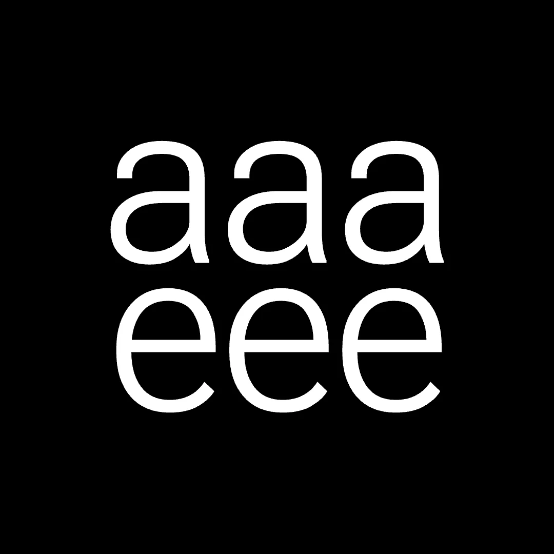
Most strong pieces stack two or three of these. The live example below layers several variable-axis waves on one word and then morphs it into a serif and back.
Where kinetic typography is used
- Social posts and Reels. Short clips for launches, sales, quotes and event dates, often in a vertical 9:16 format.
- Lyric videos and music promos. Lines arrive on the beat; type carries the mood of the track.
- Title sequences and trailers. The original home of the craft.
- Product launches and explainers. A feature name, a claim, a price, each in its own beat.
- Motion posters. Event and exhibition posters on screens, websites and social.
- Brand systems. A recurring way the brand's type moves, so every clip feels related.
What makes kinetic typography work
Movement is easy to add and easy to overdo. These are the principles that separate a clip people read from one they scroll past.
Start from the message. Decide what the viewer must remember and build the motion around that word. A five-word line usually needs one hero word, one supporting phrase and a clear end frame.
One move per beat. If a word scales, rotates, changes colour and glitches at once, the viewer watches the effect and misses the word. Give each moment a single action and let the next beat bring the next one.
Timing carries the feeling. Fast entrances with a small overshoot feel urgent and energetic. Slow fades and long holds feel calm and confident. Read the line aloud: where your voice stresses a word is often where the motion should land.
Type choice is part of the motion. A heavy grotesk can take big scale and rotation. A delicate serif often looks best with restrained moves. Fonts with a lot of character need less animation.
Design for sound off, then add sound. The clip should make sense muted. Sound then sharpens the timing: a hit on the key word, a rise before the reveal.
Hold the last frame. The end is where the name, date or call to action sits. Give viewers enough time to read it before the loop starts again.
If the words still read clearly with every effect switched off, the motion is helping. If they don't, it's decoration.
How to make kinetic typography
There are two broad ways to work.
Keyframe animation in desktop software. After Effects is the classic tool: you animate each property of each layer by hand, often with plugins and expressions. It gives complete control and is the right choice for complex title sequences, character animation and compositing with live footage. It also takes time to learn, and every new clip starts from a timeline.
Preset-based tools in the browser. In Swash you type the words, choose a font and apply a preset. Each preset is a complete animation, so changing the text, font or colours keeps the motion intact. From there you can:
- stack presets for longer moves, as described in Combine presets;
- animate the axes of a variable font or morph between fonts;
- turn text into a ring, sphere, helix, cube or sheet in Camera and 3D;
- add one of 41 shader effects and an animated background;
- time a sound to each move from a library of over 270 sounds (Sound);
- export an MP4, a GIF or a single PNG frame (Export).
Every clip on this page is a template from the Swash Community. You can open one, change the words and export your own version: try Weight wave, Mobius, Marquee font morph or Keep moving, or browse all templates. The editor runs in the browser and you can try it without an account; Your first animation walks through the basics.
Questions about kinetic typography
Can you make kinetic typography in Canva or CapCut?
Both offer basic text animations such as fades, pops and typewriter effects, which are enough for simple captions. For variable-font motion, font morphing, 3D type or shader looks you need a tool built around typography, such as After Effects or Swash.
How long should a kinetic typography video be?
For social feeds, short clips of a few seconds to around fifteen seconds work best: one message, one hero word and a readable end frame. Lyric videos and title sequences run as long as the song or the opening they accompany.
What fonts work best for kinetic typography?
Bold sans serifs read well at small sizes and survive fast motion. Variable fonts add the most possibilities, because weight and width can animate. Swash includes about 200 open-licensed fonts, browsable on the typefaces page, and you can upload your own.
Is Swash free for kinetic typography?
Yes, you can start for free. The free plan has the full editor, up to 3 projects and export up to 720p at 30 fps with a Swash watermark, plus a few watermark-free exports each month. Pro is $12 a month: no watermark, export up to 4K at 60 fps and the premium presets, templates and fonts; see Plans and limits.